C&N Coursework, Context & Narrative Blog, HNC Photography, Part 1: The Photograph as a document, Project 3: Reportage
Exercise
Find a street that particularly interests you – it may be local or further afield. Shoot 30 colour images and 30 black and white images in a street photography style.
In your learning log, comment on the differences between the two formats.
What difference does colour make? Which set do you prefer and why?
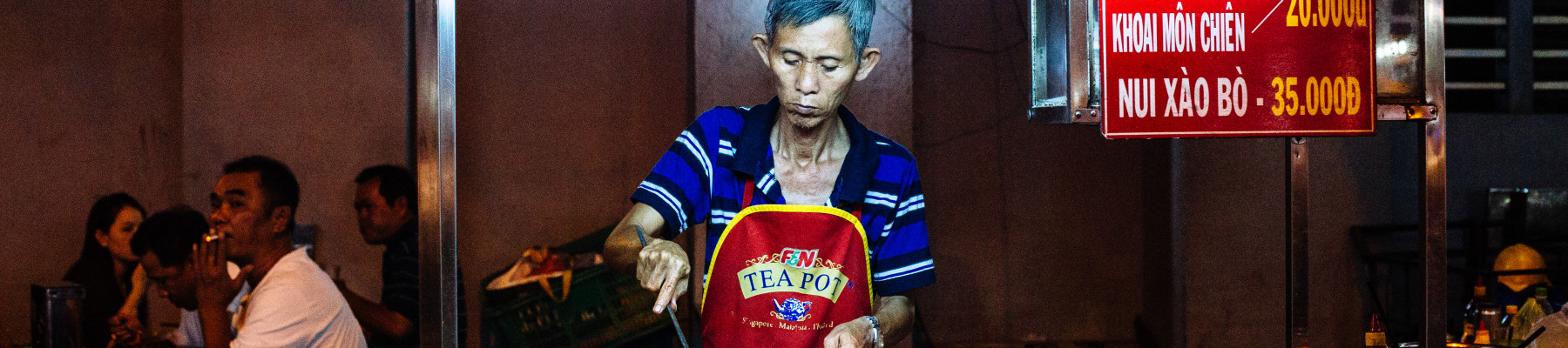
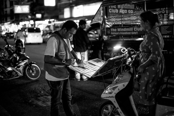
For this exercise, I wander around taking shot in central Pattaya with the intention of then converting them to black and white in post-production. I believe that this is the best way to evaluate the difference between black and white and colour.
I think I should first state that I am a black and white fanboy – think it comes from my day at night school in the mid 90’s where 90% of my work was in black & white shot on Ilford fp4 or hp5 and processed myself in the darkroom and that when I was growing it was photojournalism and sport photography that brought me into photography and this was mainly seen in newspapers that were in those days exclusively black and white.
Colour Set

Colour adds another dimension to a flat image that a photograph is it and bring a scene to life, the colours can add details and the colour palette of an image can age an image.

Black and White Set

Black and White is more about the shape and the form in an image its graphical representation. Colours is no longer important but this is replaced by the tones and shades within the image. Black and white can appear timeless at first appearance.

Which of these sets to I like the most it is hard to pin down, the straight-out-of-camera feel of the colour images is rather flat and uninteresting, even more so that the effect I was looking for as the overall colour palette of some of the images is quite monotonic and even a simple conversion to black and white does not change this flatness.
The night images when in both Colour and Black & White stand out more from their peers as the light envelopes the subject and illuminates and it is at times like this where it would be sad to convert to B&W (unless there was horrendous colour noise you needed to conceal).
THe post production is key to the presentation of images and no more so is that in the choice of B&W or colour – assuming we are shooting digital where the decision can be taken in the post. A photographer has to make the choice why is he presenting his pictures in Black and White, this something that I learnt in Expressing your vision, Black and white has an artic connotation we cannot simply slip in the Camera club mentality of converting a dull photograph to B&W to impress our peer with a gritty image.
Quite simply what I an trying to say is that B&W and Colour need to be considered so that when they are present they are the right tools for the job they are doing Remember this :
A 13mm spanner will tighten a 10mm nut & bolt but not as well as 10mm spanner!
Below is a gallery of 3 of the images that I have taken the time to post-process as black and white and colour.


These illustrate that there are pro & cons to the depiction of the 3 images in the 2 formats. I have indicated my personal preference in the captions.